
Photo Composite
Because weird album covers make the music worth it.
Concept & Purpose
Message: Music album cover with juxtaposing themes. (Idea: Composite a person’s body to shrink to the size of an apple and somehow interact with it, perhaps have a mouth on the apple.)
Objective: Capture people’s attention to see something weird and out of the ordinary.
Audience:
Age: 17-23
Gender: Female
Music Genre: alternative, punk
Geographic Location: Urban West Coast
Style: Minimalistic with a juxtaposed theme
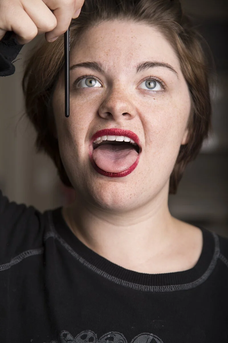
Execution: This will all be done in studio, to control lighting situations. This will require photos of the apple, photos of a mouth and then photos of a person (all with similar lighting).
Assets
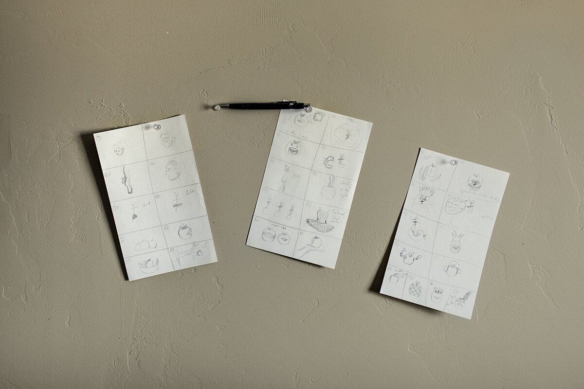
As mentioned in the message, the goal was to create a feeling of juxtaposition. I looked around Pinterest for some ideas of some creative composites and I didn’t find much of what I liked. I tried to find variations of ideas I had to see if I could spark something.
Once again, no dice—back to the sketchbook. One idea was to put a mouth on a piece of fruit (preferably an apple.) I wanted the mouth to be like Rolling Stone’s iconic mouth with the tongue hanging out. Then to throw in the theme of juxtaposition, I added a ballerina to grab some people’s attention.


Layout & Composition
While putting together the layout, I knew the ratio of the image would be 1:1, so a square is a great start right? Kind of.
I had a few different ideas and at one point the ballerinas and apples kept multiplying with each sketch, so I had to go back to the basics and let the minimalistic-juxtaposed approach take it’s course.


Layout Comp #1
Layout Comp #2
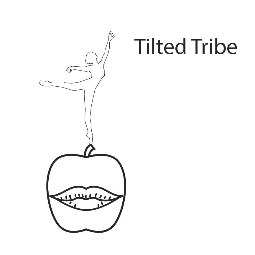
Layout Comp #3
Layout Comp #4
For the value comps I didn’t want to make it too dark of a feeling, so I avoided too much contrast. That was a struggle, with the three elements of the image–the apple, mouth, and ballerina–two of them would have a similar value and I needed to still contrast it all from the background.


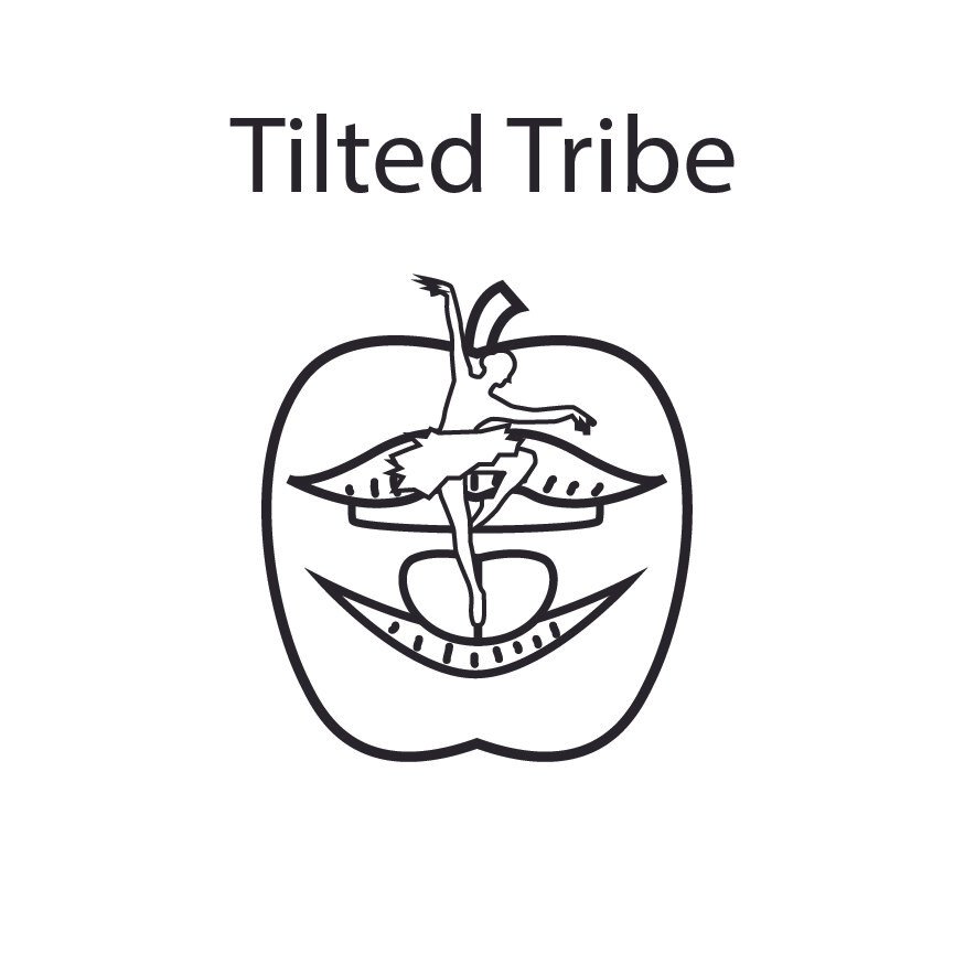
Value Comp #1
Value Comp #2


Value Comp #3
Value Comp #4
Execution
Lighting. Lighting. Lighting. If I wanted to make this successful and not look like a combination of clip art, lighting was the key.
In order to accomplish the difficulty of a photorealistic composite, I decided to use auxiliary lighting, so I could control the quality, distance, direction, and source of light. This proved to be helpful with blending images together and creating shadows later in Photoshop.


Final Product
After all the brushing and blending of different layers and layer masks in photoshop, I found myself with a rad music album cover of a ballerina on a mouth on an apple on a blue background. I don’t think Fall Out Boy is going to call me anytime soon to make them an album cover, but here’s a new mockup for an alternative/punk rock group.

